
To Burnup 📈or Burndown 📉: That’s the question!
 Transparency is an important pillar of Agile. For the Agile team, this means that they hide nothing and everyone is aware of what is happening in the project. In the non-remote setup of doing things, we use a lot of physical information radiators, a physical Agile Dashboard (Task Board), where we would move paste-it notes on different columns drawn using markers, and often use a TV screen to display the metric charts such as velocity, sprint burndown, and release burnup charts.
Even in the absence of such a physical setup, Application Lifecycle Management (ALM) tools, such as Jira, can help keep the team informed about the work progress using visual burnup and burndown charts.
Despite their popularity and the fact that they serve similar purposes, I have often seen people confused about where to use them. There was perhaps no concept of “Agile” during Shakespeare’s time, but he too would have quipped, “To Burnup or Burndown: Tis the question!”. This article tries to demystify that. Both of these charts do have some differences in their focus and the information they convey; burnup denotes “work done” over time, while burndown refers to “remaining work.” But let’s do a deep dive.
📈 Burnup Charts
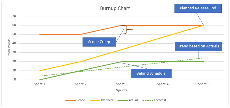
Although the Scrum Guide doesn’t officially mandate “release planning” (you can read the reason towards the end of this article), any complex project would probably begin with that. Burnup charts are typically used at a bird’s-eye level (or ‘big picture’) for tracking the progress of an entire project or a release (also often called feature charts) over a longer period of time. They show the total scope of work on the Y-axis and the amount of completed scope over time on the X-axis. This chart therefore enables the stakeholders to see not only how much has been accomplished but also the overall project scope. This helps in understanding whether the project is on track to deliver the planned features by the end of the release (aka the release goal).
📉 Burndown Charts
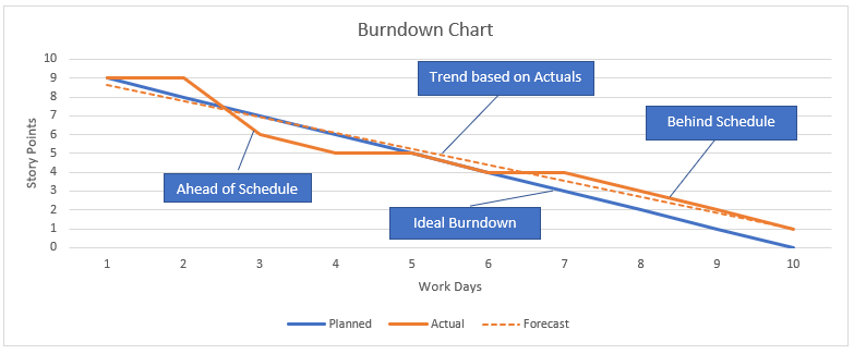
Burndown charts are more commonly used at a sprint level because they focus on tracking the completion of user stories (or even tasks, if you want the details that deep on the chart) within a specific and short time frame (usually 2 to 4 weeks). Burndown shows the amount of work remaining on the Y-axis over a period of time (the X-axis). Thus, the chart provides a snapshot of how well the team is progressing towards completing the planned work for a sprint. The ideal burndown line reaches zero by the end of the sprint, indicating that all planned work will be completed within the time frame.
Which chart is best for Release Tracking?
In all fairness, there is no thumb rule that dictates one is universally better than the other. But here are some factors to consider when deciding between the two:
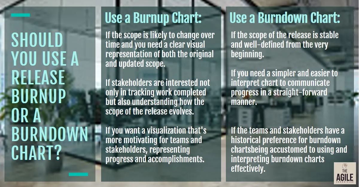
Use a Release Burnup Chart:
- If the scope is likely to change over time. A burnup chart provides a clear visual representation of both the original and updated scope.
- If stakeholders are interested not only in tracking work completed but also in understanding how the scope of the release evolves.
- If you want positive visualization. Release burnup charts appear more positive because the chart line moves upward as work is completed. This can be motivating for teams and stakeholders, as it visually represents progress and accomplishments.
Use a Release Burndown Chart:
- If the scope is stable and well-defined. The chart focuses solely on the remaining work, providing a straightforward view of progress toward completing the initially planned scope.
- If simplicity and clarity are super important. Burndown charts are often simpler and easier to interpret. It can be a better choice if the goal is to communicate progress in a clear and straightforward manner.
- If team familiarity matters. Some teams and stakeholders may have a historical preference for burndown charts since they may be accustomed to interpreting and using burndown charts effectively.
In reality, teams can experiment with both types of charts and choose the one that aligns better with their communication style, scope dynamics, and stakeholder preferences. Use a combination if that suits your audience.
Which other visual charts are 👍🏻 popular?
Apart from the burnup and burndown charts, there are several other charts that are used for sprint and release tracking and provide different perspectives on project progress. Here are a few examples:
For Sprint Tracking:
- Velocity Chart: This chart displays the amount of work completed by the Scrum team in each sprint. It helps teams track their historical performance vis-à-vis their capacity and helps them with better sprint planning. Just bear in mind: Velocity ≠ Productivity.
- Cumulative Flow Diagram: This area graph (more often used in Kanban) helps in visualizing the flow of work items through the various stages in the development process. It highlights bottlenecks, work in progress, and overall team efficiency during the sprint.
- Task Board: As discussed at the beginning of this post, this is a physical or digital board that visualizes the progress of tasks within a sprint. It provides a quick overview of task status (To Do, In Progress, Done) and facilitates daily stand-up meetings.
For Release Tracking:
- Lead Time and Cycle Time Charts: These charts help in measuring the time it takes for work items to move through the entire development process (Lead Time) or a specific stage (Cycle Time). They provide insights into process efficiency, identify delays, and aid in continuous improvement.
- Epic Progress Chart: Help in monitoring the progress of epics or large user stories over the course of the release. The chart gives a high-level view of how major features are advancing and whether they are likely to be completed within the release timeframe.
It goes without saying that the selection of any chart depends on the specific needs of your team and stakeholders, as well as the level of detail you need for effective decision-making.
Burndown/Burnup charts are visual indicators, not 🔮crystal balls
Most of the agile teams utilize some or all of the charts we have covered (especially if they are tool generated), on a daily basis, but there are some precautions you should take in terms of setting the right expectations with the stakeholders and within the team.
The Scrum Guide states, “…burn-downs, burn-ups, or cumulative flows, while proven useful, do not replace the importance of empiricism. In complex environments, what will happen is unknown. Only what has already happened may be used for forward-looking decision making”.
This is a very important statement. The Scrum Guide does not prescribe any particular tool or chart for a reason. That’s because these charts often inadvertently promote predictability. When you try to estimate the “precise amount” of labor or time required in advance, you basically go against the agile principle of adapting to any change. Unless you are cautious, these charts might give you and your team a false sense of control and assurance, which in turn could make them base their decisions (such as committing to a Sprint goal) on inaccurate assumptions.
Burndown charts also falsely promote a “fixed-scope mindset”. Agile initiatives are all about flexibility and the capacity to change course in response to changing needs and feedback. The possibility for such adaptive modifications dwindle when teams are tied into a specified scope.
According to the “Cone of Uncertainty”, since there are a lot of unknowns about the final product or work outcomes at the start of a project, estimations are very unpredictable. The degree of uncertainty tends to decline only when further research and development is conducted, and more details about the project are discovered down the line. This is the reason Scrum Guide stopped prescribing a release planning exercise.
If not a burnup or burndown chart, then what else? Some experts advise using techniques such as Monte Carlo Probabilistic Forecasting if your team’s throughput is consistent. But we will park that discussion for another article.
Which visualization chart(s) work well for your team? Is your team able to leverage them well? Do your stakeholders know about the “Cone of Uncertainty”? Please share your valuable experience in your comments.
Want a simple MS Excel template to draw a Burnup and Burndown chart? 🆓Click to download a free template.


